Category Archives: Fun with Statistics

On the Radio – GDP and Economic Recovery

Earlier this week I appeared on Paul Molloy’s radio down in Florida. We talked about the second-quarter GDP crash, why it was 9.5 percent or 7 percent instead of 32.9 percent, why it was still the worst in U.S. history, and how people can get out of it while staying safe from COVID-19.

The 15-minute-ish segment is online and starts at about 10:40 into this hour-long block.

Don’t Trust Political Memes, and Don’t Share Them

Think of this post as a public service message.

In some ways, memes are the 21st century version of the comic strip or the political cartoon. They can be quite funny, and they make their point in just a second or two. Memes have been a boon for comic-strip-style humor. Someone needs to fill the void left by Calvin and Hobbes and The Far Side, and a lot of people have ably volunteered. Anyone with a joke and basic computer skills can make a funny meme, and millions of people can share the fun. National distributors no longer serve as gatekeepers and censors, allowing some unique talents to shine that would have remained dark just a decade or two ago. This has been a wonderful development.

But for many reasons, political memes are typically riddled with factual errors and offer little more than confirmation bias. They should be shunned, not shared.

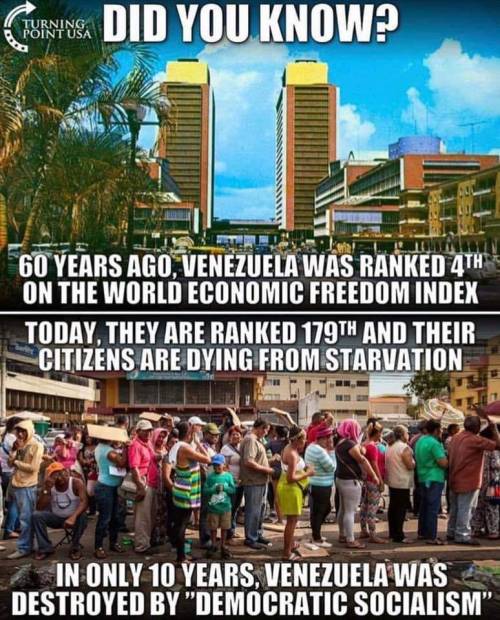
Here is a quick statistics lesson from one political meme I saw making the rounds recently. That’s not to pick on this meme specifically. There are millions like it, just as bad, floating around the Internet. This is just one I happened to see, though I should note that Turning Point USA has a poor reputation, even by its genre’s low standards.

Also keep in mind that this meme is on the correct side of its issue. Imagine how wrong the wrong ones can be! As Frederic Bastiat wrote, “The worst thing that can happen to a good cause is, not to be skillfully attacked, but to be ineptly defended.”

Here is the meme:

turning point meme

Here is a list of things it gets wrong.

1: This meme is undated and cites no sources.

2: There is no publication titled “World Economic Freedom Index.”

3: For indexes that do exist, their data do not go back 60 years. They go back to 1970 for the Fraser/Cato index, and 1995 for the Heritage/WSJ index.

4: Venezuela does rank 179th in the 2018 Heritage/WSJ index. But it gives no rankings from roughly 60 years ago. If the 4th place figure comes from a different index, that is not a valid apples-to-apples comparison. But we don’t know where that figure comes from. None is cited. Google doesn’t turn one up, either. For all we know, some intern could have just made it up, and now people are sharing it.

5: Hugo Chavez was first elected in 1998. His brand of socialism was 14 years old when Turning Point USA was founded in 2012, not 10 years before this undated meme was created.

That’s five errors in one meme that took less than ten minutes to dig up. That says more about Turning Point USA and political memes in general than it does about Venezuela’s ongoing tragedy.

Don’t trust unsourced political memes, don’t share them, and take people who heavily rely on them as seriously as they deserve–even, or especially, if they share your ideological priors.

Best Books of 2018: Factfulness

Re-posted from cei.org.

Review of Factfulness: Ten Reasons We’re Wrong About the World-and Why Things Are Better Than You Think (Flatiron Books, 2018) by Hans Rosling with Ola Rosling and Anna Rosling Rönnlund.

Think Julian Simon, Matt Ridley, and Steven Pinker’s data-driven optimism, mixed with Michael Shermer and Bryan Caplan’s awareness of human cognitive biases, as told by a kindly, avuncular Norwegian. The book reads easily, is visually savvy, and has a friendly, non-polemic tone.

Rosling, who passed away of cancer while writing this book, wanted it to be his last, grand statement. He wants people to simultaneously believe two things: that the state of the world can be both bad and getting better. Hundreds of millions of people still live in absolute poverty. But for the first time in history, the global absolute poverty rate is now below 10 percent. Improvement is coming so fast that the number of people in poverty is going down even as population increases.

Most people think in binaries—left and right, good and bad, and so on. Rosling encourages nuance. Rather than a simple binary of rich and poor countries, Rosling uses a four-level framework. Level one is absolute poverty—subsistence farming, little or no electricity, crude sanitation, high disease rates, and low life expectancy. Level four is where the rich countries are—the Anglosphere, most of Europe, and the Asian tigers. When people think of rich and poor countries, they tend to think of either level one or level four countries. As it turns out, most people in the world are middle class—they live in level two and level three countries. In varying degrees, these countries offer better health and sanitation than level one countries, along with some industrial development, education for children instead of labor, some degree of political and lifestyle freedom, and so on.

One thing I especially like about Rosling’s framework is that countries can level up. Prosperity is a process, not an on/off switch. And the number of levels is theoretically infinite. Rosling chose to use four levels, but a more granular analyst can use as many levels as they want. More importantly, it may well be that what Rosling describes as a level four country today will be startlingly poor a century from now. Most of the world will have leveled up to the equivalent of level five or higher.

Rosling also provides an important public service in teaching people how to look at data. The most important example is the lonely number fallacy:

Never believe that one number on its own can be meaningful. If you are offered one number, always ask for at least one more. Something to compare it with. Be especially careful about big numbers. (p. 130)

I used this advice in my review of Trump economic advisor Peter Navarro’s coauthored book with Greg Autry, Death by China. The data won’t allow Navarro and Autry to make the case they want, so they have to resort to trickery:

Navarro and Autry give just such a lonely number when they argue that, “On [President George W.] Bush’s watch alone, the United States surrendered millions of jobs to China.” (p. 10) Let’s give that large, lonely number some company. In January 2001, when Bush took office, the U.S. labor force was 143.8 million people. When his term expired in January 2009, it was 154.2 million people, despite the economy being in recession. The data are here.

So even if “the United States surrendered millions of jobs to China,” those losses were outweighed by gains elsewhere, most of which have nothing to do with trade policy.

Keep this in mind whenever you see a scary number in a news story—if it doesn’t come with company or context, it’s analytically useless at best.

Rosling’s book has been warmly received by a politically diverse audience, and rightfully so. Rosling’s optimism is based on widely available data, not his ideological priors. In areas where the world is not improving, he is quick to point to them as a reform priorities.

More importantly, the data show that the world’s arrows are almost all pointing up. Few people realize this—as Rosling humorously shows, most people perform worse than chimpanzees on a simple multiple choice quiz about human well-being. The errors are not random—they are overly pessimistic in participants across countries and in every demographic category.

Rosling was as effective as anyone in trying to correct pessimistic bias with facts, not least through his easy-to-understand bubble charts. Rosling’s son, Ola Rosling, and daughter-in-law, Anna Rosling Rönnlund, are carrying on his work with their group Gapminder—see, for example, their tour of Dollar Street that shows the various gradations between countries in levels one through four.

Things are bad in many places, but getting better. In fact, for most people in most places, living standards today are the best they’ve ever been. It is up to us to see that the process continues. To do that, we need to be aware of both the facts on the ground and our inborn cognitive biases that prevent us from seeing those facts clearly. From there, action. Use your head, not just your heart. You need both.

Baseball Humor

One of the things I like about the Milwaukee Brewers is that they have a healthy sense of humor. Here, relief pitcher Tim Dillard hijacks an ESPN microphone and does a spot-on impression of stat-obsessed journalist Tim Kurkjian (click here if the embedded video doesn’t work):

One Measure of Progress

This quote from friend-of-CEI Matt Ridley is too good not to share. Something to be thankful for on Thanksgiving:

Ask how much artificial light you can earn with an hour of work at the average wage. The amount has increased from 24 lumen-hours in 1750 BC (sesame oil lamp) to 186 in 1800 (tallow candle) to 4,400 in 1880 (kerosene lamp) to 531,000 in 1950 (incandescent light bulb) to 8.4 million lumen-hours today (compact fluorescent bulb). Put it another way, an hour of work today earns you 300 days’ worth of reading light; an hour of work in 1800 earned you ten minutes of reading light.

Matt Ridley, The Rational Optimist, p. 20.

CEI Podcast for October 27, 2011: How Much Do Undocumented Immigrants Cost?

Have a listen here.

A widely cited study from the Federation for American Immigration Reform claims that undocumented immigrants cost taxpayers $113 billion per year. Policy Analyst Alex Nowrasteh, author of the new CEI Web Memo “A FAIR Criticism: A Critique of the Federation for American Immigration Reform’s ‘The Fiscal Burden of Illegal Immigration on United States Taxpayers.'” finds that the study counts costs but ignores benefits, uses shoddy data, and is harmful to the ongoing immigration debate.

From Poor and Sick to Healthy and Rich

Via Russ Roberts, this is an amazing video. I’m always impressed with creative, compelling ways to use data to tell a story. And this story is one of the most important in human history: how most of humanity went from being poor and sick to healthy and rich in just 200 years.

There is still a ways to go. But if past is prologue, I’m optimistic about the future.

Interesting Correlation

Via Business Insider.

According to this graph, the higher the percentage of a country’s males aged 25-34 live with their parents, the higher that country’s sovereign debt. Remember, though — correlation does not equal causation.

For one, this graph lists 11 Eurozone countries. But that’s out of a total of 25 Eurozone countries. Was there a reason the other 14 were left out? Maybe they fit the trend. Maybe they don’t. But since they aren’t there, we don’t know.

Even so, surely for some people, living with their parents for so long is caused by a lack of ambition and initiative. Those are two key ingredients for entrepreneurship and growth, which are important debt reducers. And a lack of them could be one cause of higher social spending, which increases debts.

The story this graph tells makes intuitive sense. But one wonders how much it matters compared to the many other factors in play.

How to Lie with Statistics

Steven Landsburg uncovers a whopper. Take a look at this graph for a second. Pay special attention to the right-hand y-axis. Then click on over to Landsburg’s blog post to find out what’s wrong with it.

Misleading Statistics

Green Bay Packers general manager Ted Thompson won an executive-of-the-year award today.

The Milwaukee Journal-Sentinel’s Greg Bedard asks if it is a kiss of death for the team.

Let’s leave aside the fact that the award has no cause-and-effect relationship on the outcome of football games.

Bedard writes that in the year after winning the award, “Only four times in those 13 years did the executives win the Lombardi Trophy.”

There are 32 teams in the NFL. Only one of them can win the Super Bowl. That’s a 1-in-32 shot.

Call me crazy, but 4-in-13 actually sounds pretty good.